Mastering Engagement
Set product strategy for great user engagement, go in-depth on engagement loops, stickiness, and activation, and learn from top examples.
Activating New Users
Now you have two mental frameworks in your pocket: The Three Games of Engagement as a way to think about what value your product offers users and vice versa and the Engagement Loop as a way to describe the actions and triggers an engaged customer experiences. In this chapter on new user activation we’ll begin to put those models into practice. At the end of this chapter, we also share a special case study on how Blue Apron uses product analytics and experimentation to better activate their new users.
Why activation matters
Whether you’re at a job interview or on a coffee date, first impressions matter—and the same goes for your product. Remember when we mentioned that the average app loses almost their entire user base within a month? Turns out that in a bracket retention analysis we did of 500 million Android and iOS mobile devices, we found that 66% of new users abandon apps within the first week of install.

If you’re great at acquiring new users but unsuccessful at showing them value, you can expect that new user retention curve to dip straight to zero. It doesn’t matter if your product is great otherwise; a poor first-time experience could mean you’ve lost them forever.
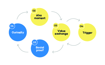
No matter which game you’re playing—attention, transaction, or productivity—engaging new users is all about offering them a small but unforgettable taste of your product’s value early, so that they come back for the second time, then the third, fourth, and more. In Chapter 1, we defined the moment when a user first derives value from your product as the aha moment. The process of getting new users to the aha moment, and then to the point where you get business value back from them is called activation.
Activation matters because users who find value and invest within your product early on will likely stick around longer. In the best case scenario, you’ll find that increasing activation rate improves new user retention, and contributes to the real growth of your business.
In this chapter, we will discuss the three phases of activation in detail and explain why new user activation doesn’t just stop at the aha moment, but continues up something called the ladder of engagement. Then, we share a step-by-step guide on how to quantitatively measure growth in the different phases of activation. Finally, we round out the chapter by sharing a case study on how Blue Apron used Amplitude and A/B testing software Optimizely to better activate their new users.
2.1 | Defining growth in new users
First, we have to talk a little bit about how we’re defining activation in this playbook and why this matters for measuring new user growth.
According to Tanner McGrath, Head of Analytics at Amplitude, and formerly PM of Growth Engineering at Postmates, real growth is about driving scalable and repeatable business outcomes. This means metrics like total number of app downloads, new account sign-ups, and Daily Active Users are poor measures of new user growth. They’re vanity metrics that fail to measure real usage or engagement in your product and the real ROI of your marketing spend "Make Your Pirate Metrics Actionable".
We calculate real growth in new users by measuring activation.
Most of the existing content out there about activation define a new user as activated when they have a good user experience and derive value for the first time. 500 Startups’ founder Dave McClure describes activation as "users enjoying their first visit", "Startup Metrics for Pirates".
Throughout this chapter, you’ll see that we define activation more strictly than others. Activation isn’t only about bringing users to the aha moment. We define activation as the point at which a user finds value in the product and goes on to provide value to the business. This value can take the form of viewing an ad, making a purchase, or converting from a free trial to paid subscription. What matters is that the user make a tangible contribution to your business—and, thus, contributes to the real growth of the business.
With that, let’s explore the subphases of new user activation.
2.2 | Breaking down new user activation
You’re probably familiar with a typical growth funnel. Let’s look at it through the lens of new user activation.
Marketing teams typically own the awareness stage, getting people to notice and learn about your product and brand. Growth teams tend to own the acquisition stage, using both marketing and engineering efforts to increase the number of registered users. The product team touches all phases of the growth funnel, playing a major role in the activation, retention, and revenue phases.

We can unpack the activation phase specifically into three critical steps: onboarding, the aha moment and the ladder of engagement, and the first value exchange.

PMs rightly obsess over the journey a user takes from registering for a new account, performing a core action, and then coming back to the product for the first time after account creation. Let’s dig into each subphase of activation in order to see how each one can make or break the early success of a product.
TERMS TO KNOW
– Activation is the point at which a user finds value in the product and also provides value back to the business.
– Onboarding is your product’s first date with a new user. The process by which new users get acquainted with your product and first discover value.
– An aha moment is the moment or set of actions within your product that leads users to first discovering value.
– Ladder of engagement is the "ongoing learning journey a new user embarks on to become an expert."
– First value exchange is the first exchange of value between a new user and the business.
2.2.1 | Activation Stage 1: Onboarding
Whether you’re talking about a B2B product playing the productivity game or a B2C app playing the attention game, how you onboard your new users is mission critical to keeping them around. Onboarding, the first phase of new user activation, is the process by which new users get acquainted with your product and first discover value. In other words, onboarding is your product’s first date with a new user. The type of experience you provide your new users here will determine whether those users come back for a second time.
When you think about improving activation, you’d be wise to dig into the onboarding process first. This means starting with the sign-up page and understanding the first several steps a new user needs to take in order to realize value. How can you make those steps easier? Faster? More enjoyable?
ConversionXL, a leading source of education on conversion optimization, categorizes onboarding flows into three types "6 User Onboarding Flow Examples".
– Doing-focused onboarding is an experience that gets users to do meaningful actions within the product.
– Benefit-focused onboarding is an experience that walks users through a specific product function that would be beneficial to the user.
– Account-focused onboarding is an experience that walks users through an account or profile creation process.
Let’s dive into each one and see how it relates to your customer engagement game.
Doing-focused onboarding
In a doing-focused onboarding flow, your goal is to get users to test-drive the actions that make your product useful or interesting. Building a doing-focused onboarding flow makes sense if your product is built around a unique form of behavior or around taking repetitive action—a mobile game is a good example.
In this onboarding style, you need to quickly and effectively demonstrate how to use your product not necessarily why to use it. A product like Tumblr, for example, needs to quickly instruct its new users on how to create a new post.

Tumblr uses a large tool-tip next to the new post window to offer advice while you compose your first post. They offer guidance first on styling your text, and then on managing your blog after your first published post.
Doing-centric onboarding need only be as complicated as your product. In fact, it should definitely not be more complicated than your product—the ideal onboarding experience for a mobile game, for example, is the minimum instruction necessary to make sense of the mechanics of the game.
In Hole.io, for example — the #1 free game on the App Store at the time of writing—the entirety of onboarding is a 3 second message that flashes across the screen before the game starts: "Drag your finger to move your hole."

While doing-focused onboarding is great for products playing the attention game, it can equally benefit transaction and productivity players as well. For example, the online marketplace, Etsy,encourages brand new users to begin browsing and favorite items they find interesting. Etsy’s onboarding flow is centered around doing this particular action. The flow makes it clear to the user that favoriting items is linked to better recommendations and personalization of their feed "How E-commerce Apps Entice Users With Laser-Focused Onboarding".
Benefit-focused onboarding
Benefit-focused onboarding is similar to doing-focused onboarding, but you’re not just getting your users to go through the motions of using the product. It’s all about making sure that the 2-3 core benefits of your product are extremely clear to your end-user, and that they know—once onboarding is said and done—how to achieve those benefits through your app or product.
This style of onboarding, which focuses specifically on showing off a product’s core benefit or function, is characteristic of products playing the productivity game. This makes sense, since the core value of productivity-focused products is improving efficiency for users.
Benefit-focused onboarding can be as easy and simple as literally stating your product’s benefits, as Evernote did.

*Evernote’s first few onboarding screens "6 User Onboarding Flow Examples".*
But in most cases, saying what you’re good at is not enough. Most B2B software is complex enough that unless the onboarding walks through doing specific actions that offer value, you risk your new users not understanding the point of your product.
Typeform, for example, walks new users through creating their first new form, their core product offering. By the time the user is finished, they’ve hopefully gotten a good introduction to the the product while also creating something beneficial for themselves.

*Typeform’s onboarding flow walks new users through building their first form "How User Onboarding Powers Typeform’s Organic Growth".*
Account-focused onboarding
Social media applications, common attention game players, are prime examples of products that follow account-focused onboarding. A core part of onboarding in Twitter, LinkedIn, and Pinterest, for example, is having new users complete a profile and connect with other users. The goal is to make sure the new user has their account populated with interesting content when they first arrive, as well as a network of people to interact with.
Twitter’s latest onboarding flow captures this to a tee. When a new user first signs up, Twitter asks them to create a username and then immediately asks what type of content the user would be interested in. The next screen prompts the user to find friends who are already on Twitter.


PRO TIP
Activation is not just about onboarding. Activation is about building trust with your users. Onboarding is about logistics. A 10x improvement to your North Star metric doesn’t come from endless, minute optimizations of your onboarding flow or sending yet another email. It comes from providing a core value of your product early on in the new user experience.
If these styles of onboarding are blurring together, don’t worry! Most products use a blend of doing, benefit, and account-focused elements along with a number of other strategies outside of the product itself (like emails and tutorials) to get new users started on the right foot.
Regardless of what engagement game you’re playing or how you design your onboarding, keep in mind that the goal of onboarding isn’t to show off every single amazing feature of your product in one session. It’s to tantalize them just enough that they experience an aha moment and know just enough about the product’s value they see a reason to use it again.
General onboarding best practices
2.2.2 | Activation Stage 2: The aha moment
Onboarding is the the series of actions that drives a curious new user to an aha moment. Experiencing an aha moment is what separates users who find value in your product (and will hopefully continue to find value) from those who do not.
There’s a ton of content out there on why the aha moment matters and how to determine what it is for your product this article "This Is How You Find Your App’s Aha Moment" is a good place to start. The most important thing to know is that the aha moment helps companies connect their higher-level goals to actions that users take within their product. The aha moment lets you think more upstream of that goal. Instead of just asking, "How do I increase activation or conversion," you can ask yourself, "What early core actions best correlate with long-term success?"
This is exactly what Facebook did.
Whenever people think about the aha moment, the infamous story about Facebook’s path to 1 billion users always comes to mind. Chamath Palihapitiya, who was Facebook’s VP of User Growth at the time, said the entire Facebook team doubled down on one metric: getting new users to add 7 friends in 10 days. This single action—their aha moment—contributed to better activation and growth to 1 billion users. When reflecting about this aha moment, Palihapitiya said:
"We were able to reframe the entire experience around that one simple premise, a very simple elegant statement of what it was to both capture core product value, to define what it meant to be able to onboard into a product that allowed you to communicate, to get into a network, to find density, and then to basically iterate around that." "How We Put Facebook on the Path to 1 Billion Users"
The aha moment concept has its merits: it can serve as a north star for product teams working on activation and it can be used to unite the entire company around a single elegant insight. But take this with a grain of salt—discovering an aha moment for your product might be great for kickstarting your growth. But a long-lasting engagement strategy isn’t built off one magical moment. In Section 2.3, we’ll take the aha moment to a level deeper.
Before that, let’s cover the third stage of activation: getting to the first value exchange between customer and business.
2.2.3 | Activation Stage 3: The first value exchange
The third and final stage of activation describes the first exchange of value between a new user and the business.
Again, keep in mind that most existing content talks about activation from the perspective of the new user finding value in your product; in this playbook, we describe activation as a mutual exchange of value.
As we described in Section 1.4, customer value exchange takes different forms depending on the type of engagement game you’re playing, whether that’s ad engagement, upgrades, subscriptions, referrals, or something else.
For free attention products and games, the first value exchange often happens passively, with little to no added effort from the user. For example, as soon as new users of Pinterest and Instagram finish onboarding and begin engaging with the product, they become targets of sponsored content and ads. The exchange of value is in motion: the user gives value by liking and engaging with content, the business receives value in ad impressions.
On the other hand, for products with a subscription model—productivity products like Evernote, for example—the first value exchange happens when users convert from a free trial into a paying user.
Products paying the transaction game have the most straightforward first value exchange. It happens with the first transaction. Keep in mind that for two-sided marketplaces, like Airbnb, the first value exchange for buyers versus sellers might be different.
Examples of products and their first value exchanges
An important thing to keep in mind is that the first value exchange doesn’t necessarily have to be the most frequent or most valuable type of exchange that happens within your product. It’s simply the first instance at which a new user, who has found value in your product, provides your business with value. A core objective of your business might then be to nudge these activated users towards a higher-value value exchange over time and ultimately increase their LTV.
EXAMPLE
How Pokemon Go (and other free games) make money
Many free-to-play mobile games make money through ads, sometimes even offering an ad-free experience for a small price. But what about games that don’t seem to serve their users ads?
Games like Pokemon Go have a wealth of user data that they can share (in aggregate) to advertisers and other third-parties to make money. This is probably the first way Niantic, the developers behind Pokemon Go, derived value from their new users, but it’s certainly not the main source of revenue.
It’s more likely that the highest-value value exchange for Pokemon Go and other free-to-play games is the thousands of in-game microtransactions that happen over a relatively small subset of users everyday. Mobile game developers often track and analyze the behaviors of their biggest spenders—"whales"—in order to optimize their experience (and maximize revenue), while also balancing the experience of their free users.

2.3 | The ladder of engagement: going beyond the aha moment
We’ve talked about the stages of new user activation at a high level, but let’s go back for a moment to our discussion about the aha moment.
The weakness of the aha moment concept is that it treats activation like a straightforward path from A to B. In Facebook’s case, the aha moment seems to imply that "friending" leads directly and obviously to retention. This type of direct correlation is simple, elegant, and easy to rally around and, as such, the aha moment can be a highly useful internal motivator. But as an entire framework for product strategy, it is insufficient on its own.
Retaining customers for the long term requires the product 1) provide continuous value to users and 2) users develop new habits that include using the product. Users don’t just snap into habits because they added a certain number of friends within a certain number of days. They acquire habits over time. They make decisions over the course of many moments—not just one "magical" one. And if a product can keep giving them value across those many moments, then users will stick around.
Rather than a direct path from A to B, it’s more realistic to think about activation like a ladder: a series of increasingly sophisticated steps that eventually lead the new user to the top, aka the point of long-term retention.
2.3.1 | Defining the ladder of engagement
According to Josh Elman, Partner at Greylock and former product leader at Twitter and LinkedIn, the ladder of engagement is the "ongoing learning journey a new user embarks on to become an expert."
The ladder of engagement is useful because it breaks down your product into tasks that your users either need to do or understand in order to see value "Building your growth model and Ladder of Engagement". The first few rungs of your product’s ladder should set the stage for deeper engagement. Here at the bottom of the ladder, you are onboarding new users, showing them the ropes, nudging them to perform critical actions, facilitating learning, and so on.
As users delve deeper into your product, and ascend the ladder, you need to bring them more value and deepen their engagement. The higher they go, the better they should feel. The topmost rung of the ladder is usually where you’ll find your power users—the people who are highly engaged and have usually achieved the highest degree of sophistication in your product.
In Elman’s original blog post on the ladder of engagement, he lays out what it looked like for Twitter circa 2010.

On the bottommost rung, a user understands what a tweet is. At the topmost rung, a user learns to build their following. Twitter considered onboarding and first value exchange as Rungs 1-4. They determined that those were the most important steps to getting new users successfully onboarded, activated, and retained.
PRO TIP
The topmost rungs of your ladder of engagement might be behaviors or actions that only your most savvy power users do. And that’s okay! Users don’t have to make it to the top of your ladder to get value out of your product or to be retained (and, in fact, most of users probably won’t make it here). Value exchange can occur at different rungs of the ladder.
It’s easy to look at an example of an already successful product and work backwards to build out their engagement ladder in your mind. But, building your own engagement ladder isn’t always so straightforward, so we’ve included some tips below.
General tips on building your ladder of engagement
Before you start, know which engagement game you’re playing and what customer value exchange looks like for your product.
If defining the first rung of the ladder is tough, start at the topmost rung and work down. What do you want your power users doing and why? How should users arrive at this point?
Understand the proportion of users who live at each rung of the ladder. If there’s a huge gap between users who reach the aha moment and users who make it beyond that point, you might have to "add" a new rung of two between steps and nudge the users to climb.
Keep in mind that you will have to rethink and iterate on your ladder of engagement as your product evolves and/or as you uncover new insights about your users’ behavior.
For activation PMs, product strategy is all about figuring out the bottom rung of their engagement ladder. The bottom part of the ladder is actually one of the most critical and challenging aspects of building an engaging product. Here, PMs in charge of activation should be asking themselves what action is simple enough to get users to see enough of the product’s that they would want to continue to engage with the product. In some cases, it might be what’s thought of as the traditional aha moment—the first time a user discovers value. In Facebook’s case, this would be the "new users add friends" action. In Twitter’s case, the bottom rung is not necessarily the aha moment—it’s about educating new users what a Tweet is. Without this as the bottom rung new users won’t be able to perform any other actions within the product.
A key success metric for activation PMs is the conversion rate between signup and the bottom rung of the product. We’ll discuss this in more detail in Section 2.4.
Now, let’s look at the ladders of engagement for companies playing either the attention, transaction, or productivity game.
2.3.2 | Attention Game: Facebook’s ladder of engagement
Remember that products playing the attention game seek to capture their users’ time by offering them entertainment, information, stimulation, or relief. Facebook is an obvious example of a product playing the attention game.
Before the world knew what Facebook was, Mark Zuckerberg and his team faced a challenge when it came to getting new users to engage with the product: they needed to convince people to leave the social networks they knew, give their information to a new one, and start using it, even if their friends weren’t all there yet.
Let’s look at what a hypothetical ladder of engagement for Facebook would look like circa 2011-2012—right around the time it began skyrocketing to 1 billion users.

The first rung of the ladder reflects the aha moment that the team rallied around—the seven friends in ten days insight. If users failed to get on this rung, they were far less likely to stick around. At Rung 2, users arrive at the first value exchange—in the beginning of 2012, the content they consumed here included sponsored content and ads.
Rungs 3-6 reflect actions that typical, engaged users performed and Rung 6 reflects the behavior of their power users.
You’ll notice that there are two types of engagement within Facebook. Users can engage with the content that their friends have created by liking, tagging, commenting, etc. Or, users can create their own original content by making a status update or uploading an album, etc.
According to a report by Pew Research Center, at the time, engaging with other people’s content was the most frequent type of engagement on Facebook in 2011. Therefore, these actions are closer to the bottom of their engagement ladder—it’s easier to engage with others than create yourself. On the other hand, creating original content was an activity mainly performed by power users in 2011 so it follows that this action makes up the topmost rung "Why most Facebook users get more than they give".
2.3.3 | Transaction Game: Lyft’s ladder of engagement
Remember that products playing the transaction game generate value via commercial transactions taking place online. These products are typically trying to maximize how much and/or how often users spend. E-commerce platforms, two-sided marketplaces, ride hailing services like Lyft are among some of the types of companies that play this type of game.
Let’s take a look at what Lyft’s ladder of engagement might look like for their riders.

The bottommost rung of Lyft’s ladder of engagement—completing a ride—might be the simplest way a new user can engage with the product, but it’s probably also the most common way users exchange value with the company. That is, if every Lyft user just stayed on this rung and just regularly requested a ride, the company would stay in good shape. Higher rungs may reflect additional ways that riders can engage with the product, but the core of this transaction game stays near the bottom of the ladder.
As a transactional company, it’s unlikely your ladder is going to have as many rungs as that of an attention or productivity-driven product. It’s in the nature of the game that you’re generally more interested in customers getting on and off the ladder at regular intervals rather than getting on and climbing further up and up at a constant rate.
2.3.4 | Productivity Game: Evernote’s ladder of engagement
Companies playing the productivity game care about whether their users are efficiently and successfully completing tasks. When you’re running a product based on productivity, your goal as a product manager is to bring people to the place where they’re the most successful. Note-taking app Evernote is an excellent example of a productivity player.
Here’s a hypothetical ladder of engagement for Evernote.

Notice the topmost rung is use visual search. The feature is a powerful one for Evernote since one of their differentiators is the ability to transcribe uploaded images and handwritten notes, then allow you to search them.
Let’s say this feature is one of the stickiest features of the product, but it’s something only power users do regularly. Evernote’s ladder of engagement could be built to point towards that feature, with every rung of the ladder designed to accumulate value for the user.

The first rung might be the very basic act of content creation—writing a note. Rungs 2-4 can then familiarize the user with the product and nudge them towards adding more multimedia content to their notebook. As users add more visual content, the chances that they use the visual search feature increases. Pretty soon, they’re taking advantage of this and other features that make switching to another note-taking app costly. They’re locked into the product.
At this point, you might be wondering how exactly you should help nudge users between rungs of your ladder and where this all fits in with the engagement loop that your product needs to have. Never fear: this is what we’ll be discussing in Chapter 3.
We’ve covered a lot of models and frameworks so far in this chapter—now let’s look at how to put numbers to each phase of activation.
2.4 | Measuring Activation
In the last section of this chapter, we will cover the analyses you can perform to diagnose and improve new user activation in your product. Remember that we’ve divided up activation into three phases: onboarding, aha moment (ladder of engagement), and the first value exchange.
Measuring new user activation is really all about two metrics:
– Conversion between the different steps of your onboarding funnel, and especially to the aha moment and the first value exchange.
– Retention of newly activated users who repeatedly perform the value exchange event.
And finally, to measure real growth in these metrics after product changes have been made, we’ll look at how new user acquisition cohorts track for these metrics over time.
Since these analyses are best illustrated by an example, let’s go back to the AmpliTunes example product we introduced in Chapter 1.
First, we’ll set the scenario using some of the models and frameworks that we’ve discussed so far. AmpliTunes is an iTunes-like music platform that lets users play and buy songs and videos. As an AmpliTunes product manager, you already know the following:
– engagement game: attention
– aha moment: new user plays a song or video
– first value exchange: new user buys a song or video
Keep these points in mind; we’ll come back to them in the sections that follow. Now let’s get into the analyses.
2.4.1 | Analyzing onboarding
We can break down our onboarding analysis into three questions.
1 – What is the conversion rate to the aha moment?
The first stage of activation is getting users to complete onboarding and onto the first rung of the engagement ladder—the aha moment. To understand how many new users are getting from the sign-up page to this moment, you first need to define an onboarding funnel.
Some digital products have a well-defined sequence that users move through during their first-time experience. If that’s the case for you, defining your onboarding funnel is simple: just track an event for each step, and that’s your funnel.
Do it with Amplitude
Let’s say our new user onboarding flow in AmpliTunes has 5 steps: User lands on welcome page → User signs up for a trial account → User lands on the main page → User searches for content → User selects content → User plays content (the aha moment). And we want to see how many new users complete their onboarding to aha moment flow within 30 days of signing up.

– STEP 1: Create a new Funnel Analysis chart and build your onboarding flow. In the Events module, choose the events that make up funnel.
– Note that you can choose Events in this order if you want to analyze users who went through your funnel exactly in this sequence. If the exact order of events doesn’t matter to you and you’re just interested in if users performed these onboarding steps, you can choose to analyze Events in any order.
– STEP 2: In Segmentation module, choose to analyze the New Users segment. By default in Amplitude, New Users are users who perform any action for the first time. Users are considered new at the time of their earliest action.
– STEP 3: Now it’s time to do the analysis. Choose to measure by how many users completed the funnel within 30 days from their first day. This is known as the conversion window—the amount of time a user has to complete all the steps in the funnel in order to be considered "converted." Keep in mind that you can set your conversion window to be anywhere from seconds to days, depending on how you expect your product to be used.
– The from their first day selection restricts the analysis to only include new users who are new *on the day they performed the first step of the funnel*—in this case, landing on the welcome page.
– Keep in mind, that these settings counts unique users who pass through the funnel across a number of different sessions—i.e., they can exit AmpliTunes in the middle of the funnel and come back on another day and still be counted. If it’s important for your new users to complete onboarding and reach their aha moment in one session, you can change the subsequent dropdowns to read holding constant Session ID. This will count users who complete every step of the funnel in the same session.

Takeaway
From this funnel analysis, you can see that the conversion rate for users who were new on any day in the last 30 days, is 69.2%. That is, 69.2% of new users in this time frame completed every step of the onboarding funnel, in this order, and arrived at the ‘aha moment’—the Play Song or Video action. They’ve arrived at the bottom rung of the AmpliTunes engagement ladder.
Help! What if I don’t know my onboarding funnel?
If your first-time user experience is open-ended or flexible, think about the key actions they need to perform before they can start getting value out of your product—you may even want to consider conducting some user research. Or, you can make a hypothesis about your onboarding funnel by doing path analysis.
Do it with Amplitude
Let’s suppose that we don’t know our AmpliTunes onboarding flow. Pathfinder is a great way to get a sense of the most common paths your new users are taking in your product.
The report lets you specify a starting point and then see the top sequence of actions and that users performed after it. Or, you can specify an ending point and then see the top actions that users performed leading up to it. You can use this information as a starting place to design an onboarding flow or to test different ones.
Let’s say we want to know the most common sequence of actions new users in the last 30 days took after landing on the main landing screen AmpliTunes. Here’s how you would build that report for AmpliTunes:

– STEP 1: First, begin a new Pathfinder report. In the Events module, choose to look at the paths taken starting with Main Landing Screen for the new users.
– *Or* Let’s say we care more about knowing how new users get to the aha moment. In this case, you’d choose to look at the paths taken ending with Play Song or Video.
– STEP 2: For each subsequent step in the path, choose the event Top Paths. These are the top events (counting by event totals) at the time of the query.
– STEP 3: Set up the Segmentation module so you’re only looking at new users in this report. To do this, choose to analyze Users who performed the [Amplitude] New User event 1 time, any time during Last 30 days. This setup analyzes only the segment of users who performed their very first action in the last 30 days (i.e. users who were new in the last 30 days).
– STEP 4: Now it’s time to do the analysis. In the date picker on the report, you can choose to look at the most common paths in the last 30 days.

Takeaway
Interestingly, Pathfinder highlights other common paths that new users take that are different from the onboarding flow we had defined before. Some users go on to edit their profiles and then download content, while others immediately select and play a song, and still others begin following a playlist. At this point, it might also be worth looking at an incoming path analysis of users who end up playing content. Then you can think about whether to redesign a completely new onboarding flow or whether to make UI/UX improvements to your existing flow in order to redirect new users down a specific path.
2 – Where are your biggest onboarding funnel drop-offs?
To be fair, AmpliTunes’ onboarding flow is unusually impressive. Over half of the new users signing up eventually end up getting to the aha moment. If your onboarding flow looks something like this, you have a lot more cause for concern:

*Example onboarding conversion funnel showing almost a 75% drop-off between the beginning and end of onboarding.*
Whether your goal is to diagnose problem areas in your onboarding flow or to optimize something that appears to be working, the first place to investigate is where most of your users are dropping off. Once you have this identified, you can then begin to hypothesize why those users are dropping off and identify what they are doing instead.
Do it with Amplitude
If you’ve already built your onboarding funnel, identifying your biggest drop-offs won’t be difficult. Going back to AmpliTunes’s onboarding funnel at the beginning of this session, you can see that the biggest drop-off in the funnel happens between the user signing up for an account and arriving at the main landing page—once new users get here, nearly all of them complete the flow.
In Amplitude, it’s easy to get a snapshot of how many users are dropping off in your funnel: Just mouse over the striped section of the bar you care about and a new window pops up.

*AmpliTunes onboarding flow showing the step with the most dropped-off users.*
Takeaway
For AmpliTunes, you can see that 16.0% of all new users in the past 30 days abandoned the onboarding funnel after signing up.
3 – What are new users doing instead of onboarding?
Path analysis can be really useful for seeing what users are doing once they drop out of a funnel, like the onboarding flow we looked at earlier. Are these users leaving the app for good, or are they doing something else instead?
Do it with Amplitude
Again, with Amplitude, it’s very simple to get a quick sense of what’s happening to your dropped off users. Once you’ve identified where your biggest drop-off is, you can just click on that region to inspect it further—you have the option to view or download individual users, create a cohort, and see the paths these dropped-off users took without ever leaving your chart.
User path analysis shows that of 16% of users who dropped-off after signing up for AmpliTunes, almost all of them left the app and never came back.

*After clicking ‘Click To Inspect’ on the dropped-off region of this AmpliTunes onboarding funnel analysis, you can then choose to view user paths for this group of users.*
Takeaway
User path analysis can help you begin to diagnose problem areas and/or opportunities for optimizing your conversion rate. In this example, you could dig into the individual users who left the app to see if they share any commonalities—perhaps a certain browser or device type is resulting in a bad experience for some users? Or, this could prompt you to explore ways to bring new users back to the app, through email reminders or push notifications, for example, so users who do exit AmpliTunes after signing up will more likely complete onboarding within the conversion window.
2.4.2 | Analyzing the first value exchange
Next in our analysis of new user activation, is looking at the conversion rate of users who perform the first value exchange. Remember that at this rung of the ladder of engagement, not only does the product provide value to the user, the user also provides value (usually money) to the business. There are two important analyses we can look at with respect to this stage of activation.
1 – What is your activation rate?
The name of the game for this analysis is, again, conversion rate. We’re defining activation rate as __the conversion rate to the first value exchange event.__
Do it with Amplitude
If you have your onboarding funnel already set up, it’s not difficult to find out what your conversion rate to the first value exchange is: just add that step to your funnel.

*The setup in Amplitude.*
In AmpliTunes, we already know that our first value exchange moment is when a user purchases a song or video. Since we care about the purchase event and not necessarily the exact sequence it took to get there, one thing to consider this time around is to set your analysis for Events performed in any order.

*AmpliTunes funnel analysis chart for conversion to the first value exchange.*
Takeaway
The funnel analysis shows that the conversion rate between a new user first landing on the welcome page to purchasing a song or video is 24.1%.
If you want to find ways to improve this conversion rate, path analysis is a great place to start. For example, you could find out the most common inward flowing paths that users took to get to the purchase event, and then build in hooks and triggers in those places to nudge them in the direction (more on that in the next chapter).
2 – What are new users doing instead of activating?
We saw in the previous analysis that there’s a significant dropoff between users who play content and users who purchase content. Path analysis is useful for seeing what users are doing instead of activating.
Using the same funnel you used to look at conversion to the first value exchange event, you can use Pathfinder to see what dropped off users do instead of purchasing a song.

*After clicking ‘Click To Inspect’ on the dropped-off region of this AmpliTunes activation funnel analysis, you can then choose to view user paths for this group of users.*
Takeaway
Pathfinder shows that new users go through many more cycles of favoriting, searching, selecting and/or playing songs before getting to the purchase stage. This might leave you wondering how long it takes users to actually make their first purchase and whether you should make an effort to reduce the time to purchase.
3 – How fast do new users activate?
Put another way, this analysis is to understand how long new users take to convert into a paying (and, by our definition, activated) customer.
Do it with Amplitude
You can look at the time it took new AmpliTunes users to convert as a distribution of the time it took to complete the entire funnel—from the new user Welcome page to purchasing a song or video, in this case.

*The setup in Amplitude.*
To see this view, you simply have to build out your funnel to the value exchange moment, as we did in the previous section. Then choose to analyze Time to convert.
Takeaway
According to the time-to-convert view of this funnel, over 20% of new AmpliTunes users complete the entire activation funnel within 1 hour.

2.4.3 | Activated new user retention
The proportion of activated new users who come back for the first time within a certain time frame should be a key measure of activation success; this metric directly reflects not only how many new users found value in their early exploration of your product, but how many users then decided to invest in your product themselves.
Improvements in your activated new user retention can shift your product’s entire retention curve upward, by decreasing the initial dropdown that happens during a user’s early experience. This means, better overall retention of your users, a greater number of value exchanges, and, ultimately, better customer lifetime value.
PRO TIP
For a review on retention curves, product usage intervals, and different methods of measuring user retention, check out Chapter 2 of the Product Analytics Playbook Volume 1: Mastering Retention.

*Better new user retention can shift your retention curve up.*
Do it with Amplitude
In the previous section, we said that the first value exchange event for AmpliTunes is purchasing content. New users who complete onboarding, play content, and then purchase content will be considered activated. Here’s how you would build the retention curve of activated new users:

– STEP 1: Create a new Retention Analysis chart. In the Events module, set the first event to Purchase Song or Video and the return event also to Purchase Song or Video. This setup indicates that we will count users as retained if they purchase content, and then come back and purchase content another time.
– STEP 2: Set up the Segmentation module so you’re only looking at new users in this report. To do this, choose to analyze Users who performed the [Amplitude] New User event 1 time, any time during Last 30 days. This setup analyzes only the segment of users who performed their very first action in the last 30 days (i.e. users who were new in the last 30 days).
– STEP 3: Now it’s time to do the analysis. In the Measure module, you can choose to measure retention by N-Day Retention, Unbounded Retention or Custom Bracket Retention. If you need a refresher on how these differ, check out our help desk article or our first playbook, Mastering Retention.
– For AmpliTunes, we will measure N-week retention, because we’ve already determined that the product has a weekly usage interval—that is, we expect users to come back on a weekly basis.

*Weekly retention of activated users who come back and perform another value exchange event.*
Takeaway
The resulting retention curve shows the proportion of new, activated users within the past 30 days who have returned to AmpliTunes and purchased content sometime during the week. According to the curve, Week 1 retention is around 60%. This means, about 60% of new users who made a purchase, came back and made another purchase during the same week. Once again, this analysis gives you a sense of the proportion of new users that provide continued value to your business.
PRO TIP
The product usage interval is the frequency (daily, weekly, monthly, etc.) with which you expect people to use your product.
2.4.4. | Measuring real growth
Now that you’ve established baseline measurements of activation, the last type of analysis is understanding whether your new user activation is actually growing or not. You can measure the effects of product changes or targeted campaigns on new users by tracking conversion and retention of acquisition cohorts of new users over time.
At Amplitude, we often talk about behavioral cohorts—groups of users who behave in a certain way. An acquisition cohort is, instead, a group of users who start off being new during the same period of time.
TERMS TO KNOW
An acquisition date cohort is a group users who started using your product (i.e., were new) during the same time period.
Do it with Amplitude
Analyzing growth in terms of a change in activation is similar to the funnel analysis that we did in Section 2.4.2. The only difference is that first you’ll have to create cohorts of new users who began in the period of time that you care about. For AmpliTunes, we’ll look at real growth of users who were new in May, June, and July 2018.
1 – Analyzing the change in activation rate

*Acquisition cohort definition for users who were new in May.*
– STEP 1: Create the May acquisition cohort by choosing Users who had been new any time during May 1, 2018 – May 31, 2018. Save this cohort. Create the June and July cohorts the same way, changing only the time component, and save these cohorts as well.
– STEP 2: Create a funnel analysis. In the Events module on the left, choose the first step of the funnel as new users landing on the Welcome page and the final step is Purchase Song or Video.
– STEP 3: In the Segmentation module on the right, choose to view the acquisition cohorts you define in Step 1.
– STEP 4: Now it’s time to do the analysis. In the Measure module, make sure Conversion is selected and the conversion window is set.

*The setup in Amplitude.*

*Activation rate of different acquisition cohorts.*
Takeaway
If you pushed a product update or ran an effective campaign between May and July, you might see a satisfying jump in activation rate between cohorts of users. The sample chart, for example, shows that the July 2018 cohort of new users had higher activation rate than the May 2018. This is one way to measure the impact and effectiveness of your product and growth marketing changes.
2 – Analyzing the change in activated retention rate
Analyzing growth in terms of a change in activated user retention is similar to the retention analysis that we did in Section 2.4.3, the only difference being the addition of multiple acquisition cohorts.

*The setup in Amplitude.*
– STEP 1: Create your acquisition cohorts.
– STEP 2: Create a new Retention Analysis. In the Events module on the left, set the first event to Purchase Song or Video and the return event also to Purchase Song or Video. This setup indicates that we will count users as retained if they purchase content, and then come back and purchase content another time. In other words, this is looking at retention of activated users.
– STEP 3: Set up the Segmentation module on the right so you’re only looking at new users in this report. To do this, choose to analyze Users who performed the [Amplitude] New User event 1 time, any time during Last 30 days.
– STEP 4: Now it’s time to do the analysis. In the Measure module, choose to measure N-week retention.

*Example retention rates for different acquisition cohorts.*
Takeaway
In the example chart, the July cohort has higher activated user retention compared to May or June, indicating that a timely product change or campaign has positively impacted user growth. In addition to tracking changes in activation rate, this is another way to measure the impact and effectiveness of your product and growth marketing changes.
2.5 | Taking action
This chapter discussed the three phases of new user activation: onboarding, the aha moment, and the first value exchange. We expanded the concept of the aha moment into the ladder of engagement and shared examples of how companies playing each of the three engagement games might build out their ladder. We then shared several types of analyses that can help you measure new user activation.
Before wrapping up this chapter, take a moment now to reflect on your learnings. Consider the following:
– What does onboarding look like for your product? What percentage of new users complete onboarding?
– What does your ladder of engagement look like? What is the topmost rung? The bottommost rung? How many new users make it past the bottom rung?
– What is the first exchange of value that occurs in your product and how does that relate to yours business model? At what rungs of your ladder of engagement do you also have an exchange of value?
– What does retention look like for your activated users?
See it in action
In the last part of this chapter, we share a case study from our customer and transaction-game player Blue Apron. The Blue Apron Growth Team significantly improved conversion rates by figuring out where a significant proportion of new users were coming from and redesigning the first time experience for those users.
If you’re wondering what actions you can take to improve engagement and stickiness of your product like Blue Apron, that’s coming up next in Chapter 3.
Further Reading
Three Defining Components of Authentic Growth
Brian Balfour, Founder/CEO at Reforge
6 User Onboarding Flow Examples (With Critiques)
Shanelle Mullin
5 of The Best User Onboarding Examples
Jackson Noel, Co-Founder and COO at Appcues
Building Your Growth Model and Ladder of Engagement
Josh Elman, VP of Product at Robinhood, Venture Partner at Greylock
How AdRoll Drives 97% Customer Retention By Helping Customers Outside the App
Trevor Sookraj, Growth at Clearbit
5 Habits to Building Better Products Faster
Hiten Shah, Founder of KISSmetrics, Quick Sprout, and Crazy Egg
A User’s Manual for Quantifying Qualitative Research
—
Case Study: Blue Apron Uses Optimizely and Amplitude For Rapid Experiments That Activate More New Customers
The Company
Blue Apron creates incredible experiences. Founded in 2012, Blue Apron is a consumer lifestyle brand that symbolizes a love of home cooking, excitement and discovery, and deep, meaningful human connections.
Blue Apron’s core product is a meal experience that customers create using the original recipes and fresh, seasonal ingredients that are included in every box. All recipes are accompanied by printed and digital content, including how‑to instructions and stories of suppliers and specialty ingredients. Blue Apron also sells wine, which can be paired with its meals, as well as a curated selection of cooking tools, utensils, and pantry items, which are tested and recommended by Blue Apron’s culinary team.
Blue Apron has developed an integrated ecosystem that employs technology and expertise across many disciplines. The company’s supply-demand coordination activities—demand planning, recipe creation, recipe merchandising, fulfillment operations, and marketing—drive its end-to-end value chain.
The Product Challenge
The primary focus of Blue Apron’s Growth team is to build and consistently refine a digital experience that attracts new consumers and deepens engagement with current customers.
The Solution
The Blue Apron Growth team needed a tool to quickly generate hypotheses about how consumers were behaving on the digital platform and run experiments on those hypotheses.
Discovering where new customers are coming from using Amplitude
When John Cline, Senior Engineering Manager of Growth/Member Experience, used a combination of user pathing and funnel analysis in Amplitude to investigate the pages consumers were visiting before they entered the sign-up flow, he discovered that a significant proportion of people who visited the Blue Apron Recipes page continued on to begin the sign-up process.
"We have a page that lists all of our upcoming recipes. We did not think many people visited this page prior to signing up, but we realized the Recipes page actually had a higher percentage of traffic than we expected," explained John.
In order to take advantage of this insight, the team conducted a full refresh of the Recipes page to include sign-up CTAs and display even more recipes for consumers to peruse and gain a better understanding of the Blue Apron meal experience.
Using Amplitude, the team learned that its Recipe page was an important component of the digital experience that could help attract new consumers to its product. Making the upcoming recipes more prominent on the page has helped improve conversion by 5.5%.

*Old page design.*

*New page design*
"We’ve found that Amplitude is very user-friendly. Even someone who is not particularly technical can use Amplitude to dive into, study, and interpret complex product data. Amplitude helps the Blue Apron Growth team own and drive results for customers." – * Walker Fullerton, Product Manager, Growth, Blue Apron*
Using Optimizely to test personalized emails to consumers who expressed intent to purchase
During a review of the abandoned cart experience, the team saw an opportunity to improve how Blue Apron contacted consumers who expressed intent to purchase a meal (i.e. left the product in their online shopping cart), with a more personalized approach.
As part of updating the design, the team hypothesized that customers who received a personal email, sent on behalf of a member of the Customer Experience team, would be more likely to try the product.
The team conducted an experiment to study whether sending these customers a personalized email—one that introduced the Customer Experience team, offered several options to speak directly to an expert on the team, and highlighted a favorite recipe—would help improve conversion. After testing the personalized email using Optimizely Full Stack, the team saw a 7% increase in conversion.

*Old email design.*

"We can now get an early signal from the Optimizely Results Dashboard within a few days, which helps empower product and engineering managers to make decisions on their own." – *John Cline, Senior Engineering Manager of Growth/Member Experience, Blue Apron*
Results:
Using Amplitude, Blue Apron learned that their recipe pages were a great way to acquire new users. Making these more prominent has helped improve conversion by 5.5%.
Using Optimizely, Blue Apron was able to test a personalized email to consumers who expressed intent to purchase Blue Apron that improved conversion by 7%.
In this chapter…
66% of new users abandon apps within the first week of install. If you can’t show new users value early on, it doesn’t matter how good your product is — you’ll have lost them forever. How do you make sure your new users have a great early experience and arrive at an ‘aha moment’? How do you get users to see enough value from your product that you can get business value back from them?
By the end of this chapter of Mastering Engagement, you will learn why new user activation matters for the longterm success of your product, how to think about new user activation in three phases, and how to analyze new user growth without using vanity metrics.
You’ll also get to read a case study on how Blue Apron used Amplitude and Optimizely to understand how to better activate their new customers.
What You’ll Learn:
– 2.1 – Defining growth in new users
– 2.2 – Breaking down new user activation
– 2.3 – The ladder of engagement
– 2.4 – Measuring new user activation
– CASE STUDY: How Blue Apron uses A/B testing and product analytics to activate more new customers
